
Designing and Launching Dot, Our AI Assistant

In 2023 we set out to create a member-facing AI assistant that would feel approachable, trustworthy, and distinctly part of Included Health. We wanted more than a generic chatbot. The assistant needed a name, an avatar, and a design system that could grow into an ecosystem.We went through several rounds of naming explorations.
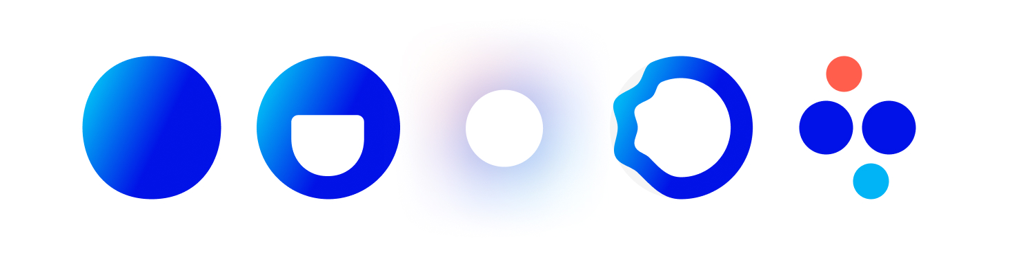
Options like Hearty, Lumi, and Wells were tested before landing on Dot, which captured simplicity, inclusiveness, and connection. Research confirmed that members trusted the experience more when it had a clear identity. An avatar and animation gave Dot a sense of presence and reassurance that made the assistant feel alive rather than mechanical.


I designed Dot from the ground up in 2023. As the sole designer and animator, I created the avatar, motion language, and overall visual identity. I introduced the team to storyboards and animatics, showing how animation could be prototyped and discussed before production.
To ensure the design could scale, I strengthened my own toolkit. I learned and applied Lottie for production ready motion and used Principle for rapid animation prototyping. These tools allowed me to test ideas quickly, refine timing, and deliver files developers could implement without friction.
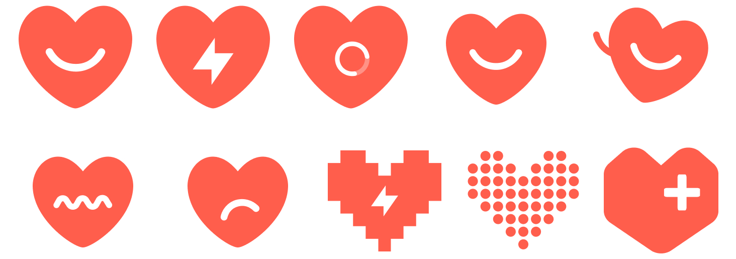
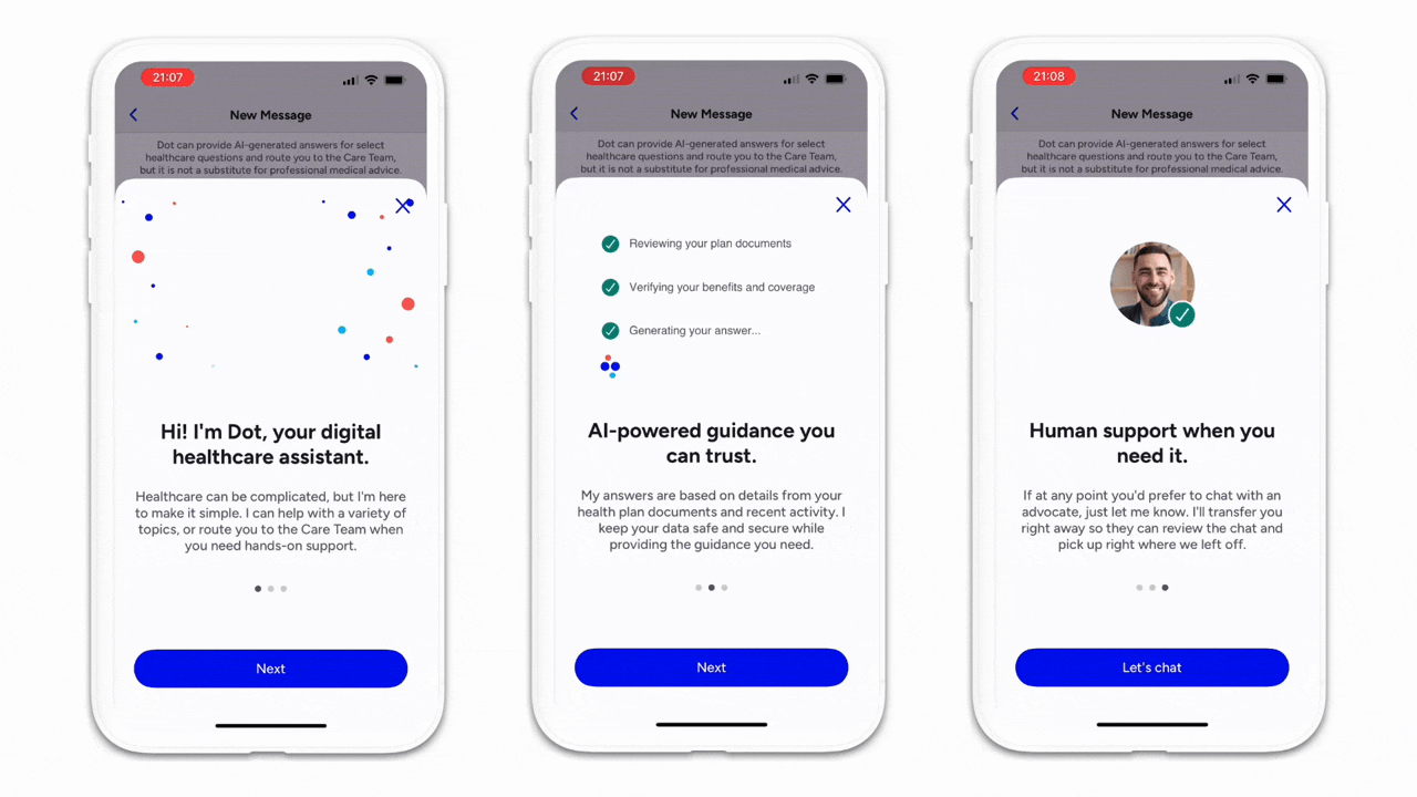
Dot had to be almost infinitely flexible, able to live in chat today and expand to other contexts tomorrow. I drew inspiration from the Included Health logo while shaping the avatar, balancing approachability with professionalism. The design was fun and engaging but careful not to feel childish. I also contributed to Dot’s experience principles, defining how animations should signal progress, how personality should come through without distraction, and how transparency and accessibility should guide the assistant’s presence.
.gif)
Dot launched in 2023 with a distinct name, avatar, and animation system that members described as approachable and trustworthy. The visual identity and motion language gave the assistant presence and personality, making interactions feel more human and less mechanical. Animations reduced uncertainty by signaling progress and reassuring members that Dot was actively working.
By introducing tools like Lottie and Principle, I shortened the design-to-development cycle, enabling engineers to implement motion more quickly and with higher fidelity. Storyboards and animatics gave the team a new shared language for discussing animation, which improved alignment across design, product, and engineering.Since launch, Dot has rapidly evolved.
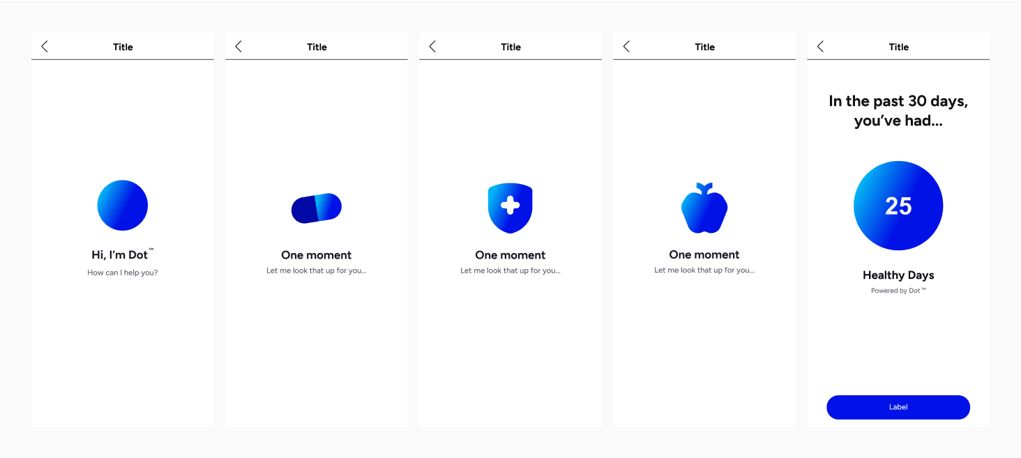
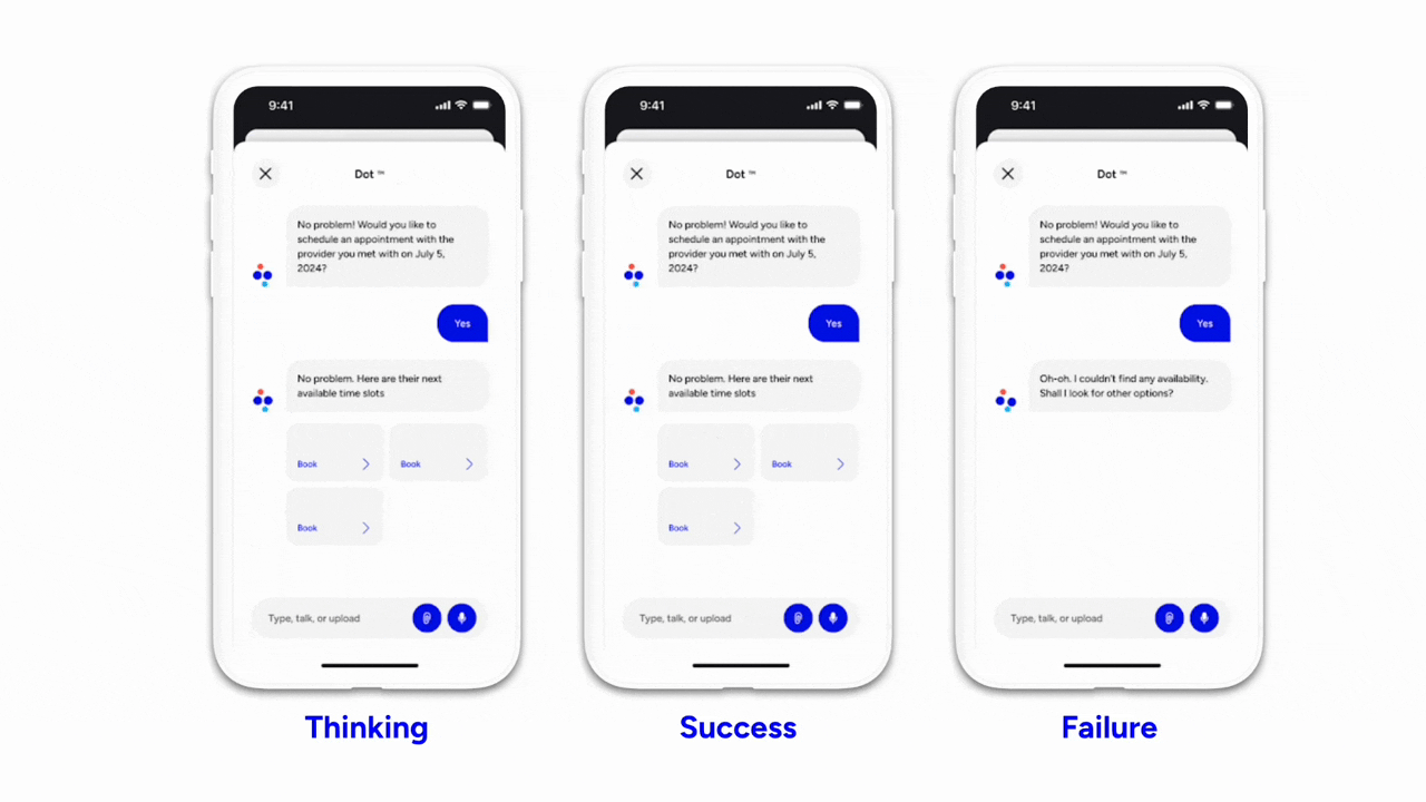
By 2025 it has become a major and increasingly intelligent part of the Included Health product. Dot now acts as a contextual helper during Open Enrollment to explain plan details, provides summaries for providers, and recommends more affordable medication options. These capabilities not only improve member confidence but also reduce significant workload from our care team, allowing them to focus on higher-value support.
Dot’s design established a flexible foundation that continues to expand. What began as a branded avatar has grown into the centerpiece of an AI ecosystem that scales across products, improves member trust, and strengthens the efficiency of our care model.